Role
sole designer: experienced the design process from research to conception, visualization and usability testing
Tool
Adobe Illustrator, After Effect, Figma
Solution
Cooking Time:
An recipe app that generates recipes intelligently based on user's preference and ingredients at hand with audio assistant, to help users master cooking and reduce food waste.
Context
As I first started my college life living on my own, it was a pain to think about what to cook and manage to go groceries. The campus is so far away from the grocery stores and I didn't have a car; what's worse, I haven't really cooked before and I was busy study! Most time, the veggies went bad in the fridge, because I didn't know what to cook :(
I really hoped that there's an app to help the "newbie" college students can live an easier life on diet wise.
But is it just me?
Although I believe it is a common problem for college students, especially for those who are in the first year — freshmen, without much cooking experience. It's not supported by research data.
User research was the path to answer my question.
Research
To understand whether it's a common problem for the potential users, to understand user's pain points, needs and goals; to get insights on what features are needed and on the top priority to solve the problem, I decided to do research.
Survey
The reason why I chose survey as the main research method instead of interviews is because the time was limited and survey allowed me to collect both quantitative and qualitative data efficiently.
Target participants were college students, 30 participants answered the survey.
Cooking takes time but college students do cook often.
59.3% of the participants takes 30-50 minutes to cook a meal.
48.4% of the participants cook 2-4 times a week, while 39.6% of the participants cook more than 5 times a week.
A recipe app which provides other formats other than textual recipes might be helpful.
39.3% of the participants don’t use recipes, 32.1% of the participants use textual recipes online.
College students would like to reduce waste, save money and time.
64.3% of the participants want to generate a recipe by the ingredients in the fridge.
85.7% of participants want to save time in cooking.
Persona
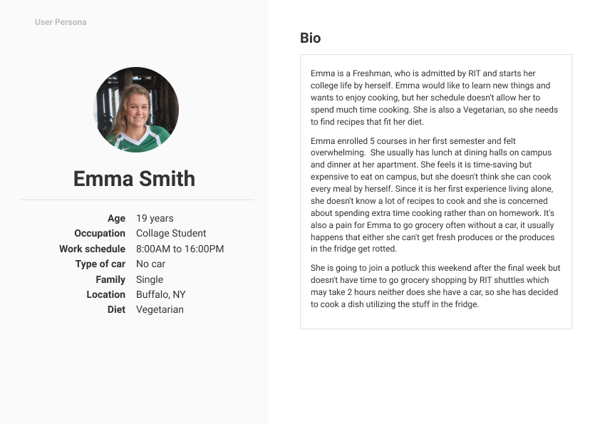
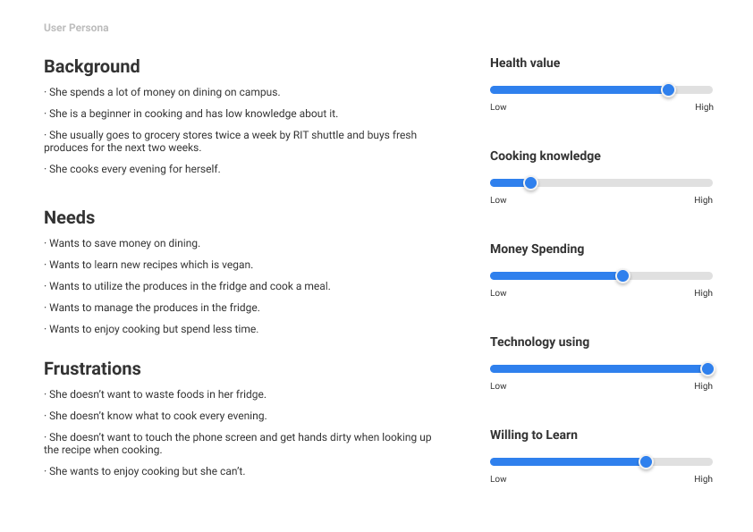
To enhance my understanding of potential users, I further synthesized the survey results and came up with the following persona:
Problem Statement/Pain Points
As a first-year college student who doesn’t have a car and just has started to cook,
1. No time to cook
2. Not good at cooking
3. Poor management of the ingredients in the fridge
Based on the user study, I narrowed down the scope and had several features in mind:
this app would generate a recipe using the ingredients in the fridge and notice users what groceries in the fridge are going expired; it would also provide suggestions on multi-tasking and calculated cooking time to the users would be able to save time.
A competitive analysis was needed, to see if there's some opportunity.
Competitive Analysis
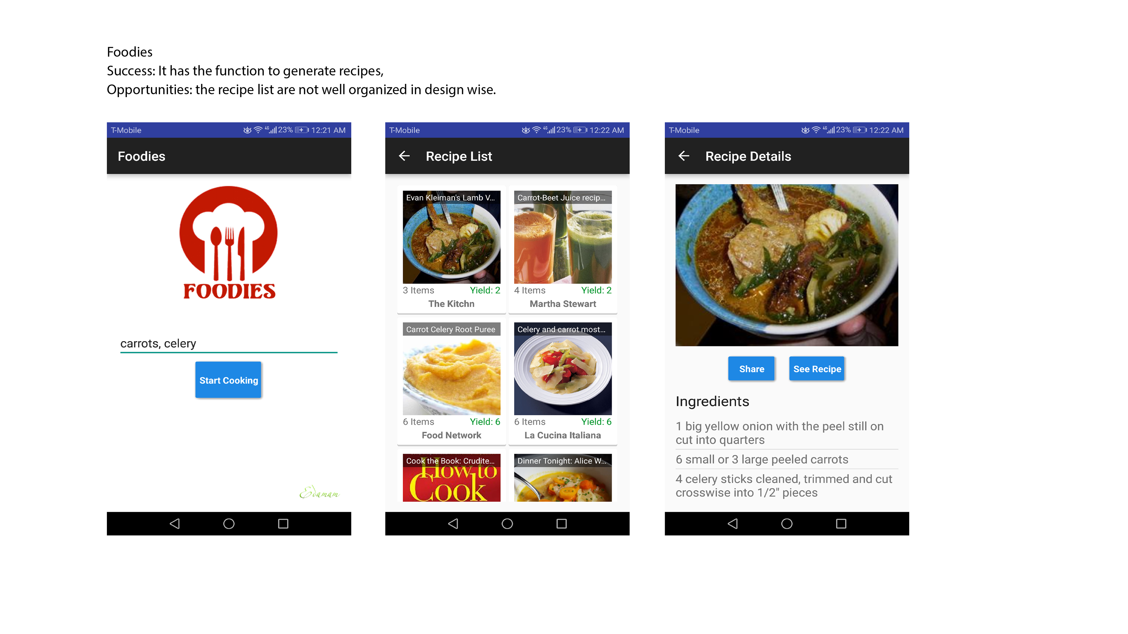
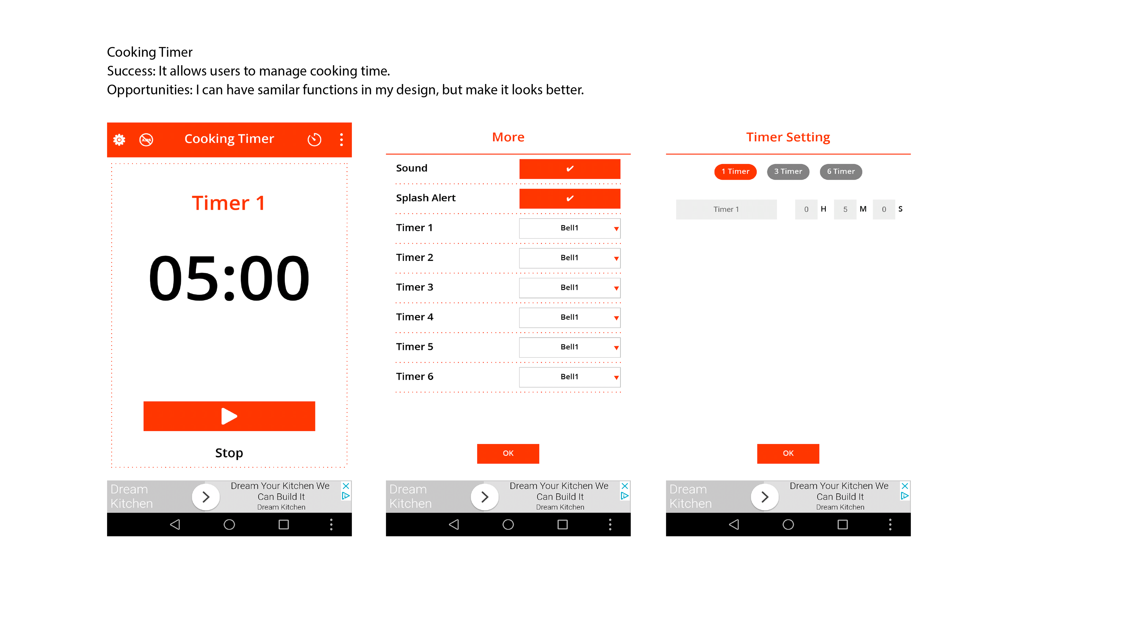
I selected 3 products on the market that have similar features to my design goals. It seems the popular recipe apps do not focus on the feature- generating recopies, multi-tasking; so I had a hard time finding more competitors.

1. allrecipes
2. Foodies
3. Cooking Timer
Insights
"Designing a smart recipe app to help college students explore what to cook for everyday meals via an interesting interaction, reduce waste and finally enjoy cooking."
Based on the research above, the app should contain the following features to meet users' need and goals:
1. multi-task when cooking to save time
2. manage fridge-stored cooking supplies
3. generate recipes that based on the fridge-stored ingredients and personal preference
Design
Low-Fidelity Prototype
This lo-fi prototype indicates 3 user journeys which apply insights to design.
User story 1: Scan ingredients, generate a recipe and review details
User story 2: Search a recipe and use the filter component to find recipes that fit the personal diet.
User story 3: Add recipes to the calculator, and generate a multitasking tutorial to cook at the same time
Paper Prototyping
I used paper prototyping as the technique to get feedback from users and communicate ideas since it was in the first stage of the design process and the designs are not final, changes probably needed.
3 participants went through the three tasks associated with user stories above.


Insight1
2 out of 3 participants were confused about the "multi-tasking" feature.
" I'm concerned that the Overcooked scenes would happen in real life!"
Insight2
Participants founds the interaction were interesting.
"I like the audio assistant feature, it would use it when my hands are dirty".
Insight3
The app was aimed to save time, it should also save time in recipe searching.
"I don't want to spend so much time searching a recipe".
Information Architecture
Based on the feedback, in order to downsize the scope, I removed the “multi-tasking” feature since multi-tasking feature is nice to have but not a must, and it doesn't merge well with other features. Meanwhile, I added "Daily Recipe Feed" to passively input and raise user's interests in cooking.
So, I reorganized the information architecture.
Modified User Flows
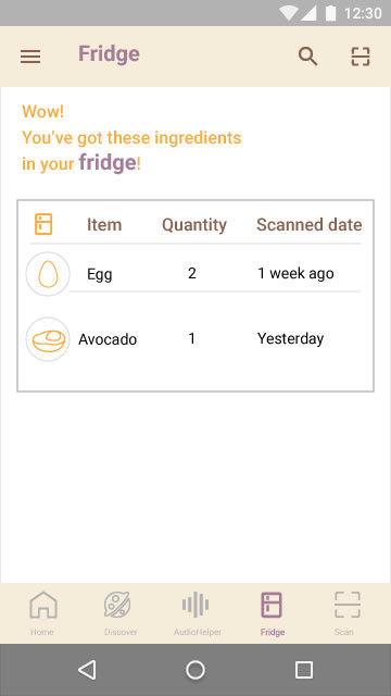
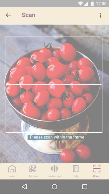
Case #1 Scan Bar Code of Fresh Produces
“As a college student who is not able to go grocery shopping very often, I’d like to scan the fresh products I just bought and manage what I have in the fridge, so I don’t waste food anymore”
Case #2 Daily Recipe Feed
“As a college student who would like to keep fit, Cooking Time will remember my preference and will recommend what to cook for everyday meals, so that I don’t need to struggle with how to cook and eat healthy meals.”
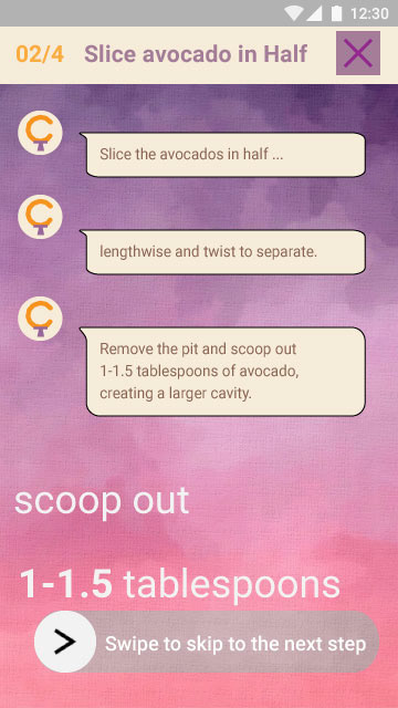
Case #3 Audio Helper
“As a college student who is a super user, I would like to use Audio helper to cook according to the recipe, so that I can know how to cook and save a lot of time in cooking.”
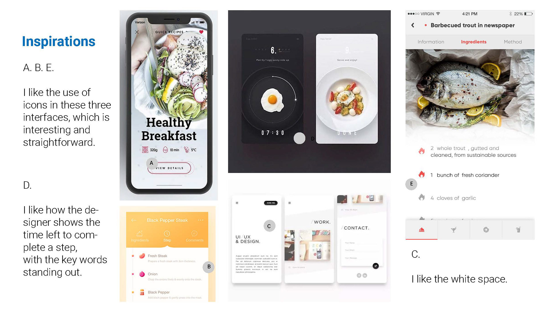
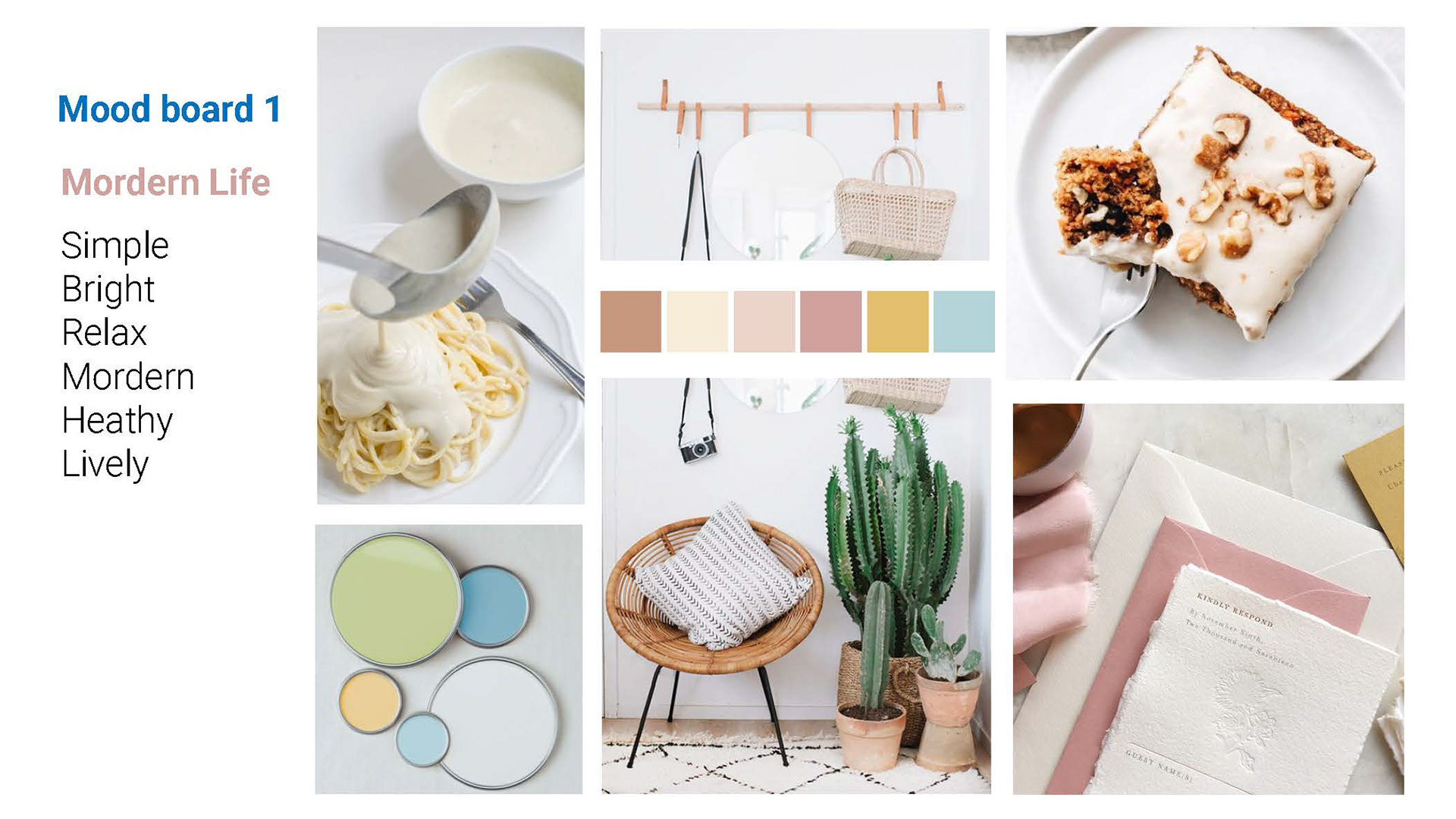
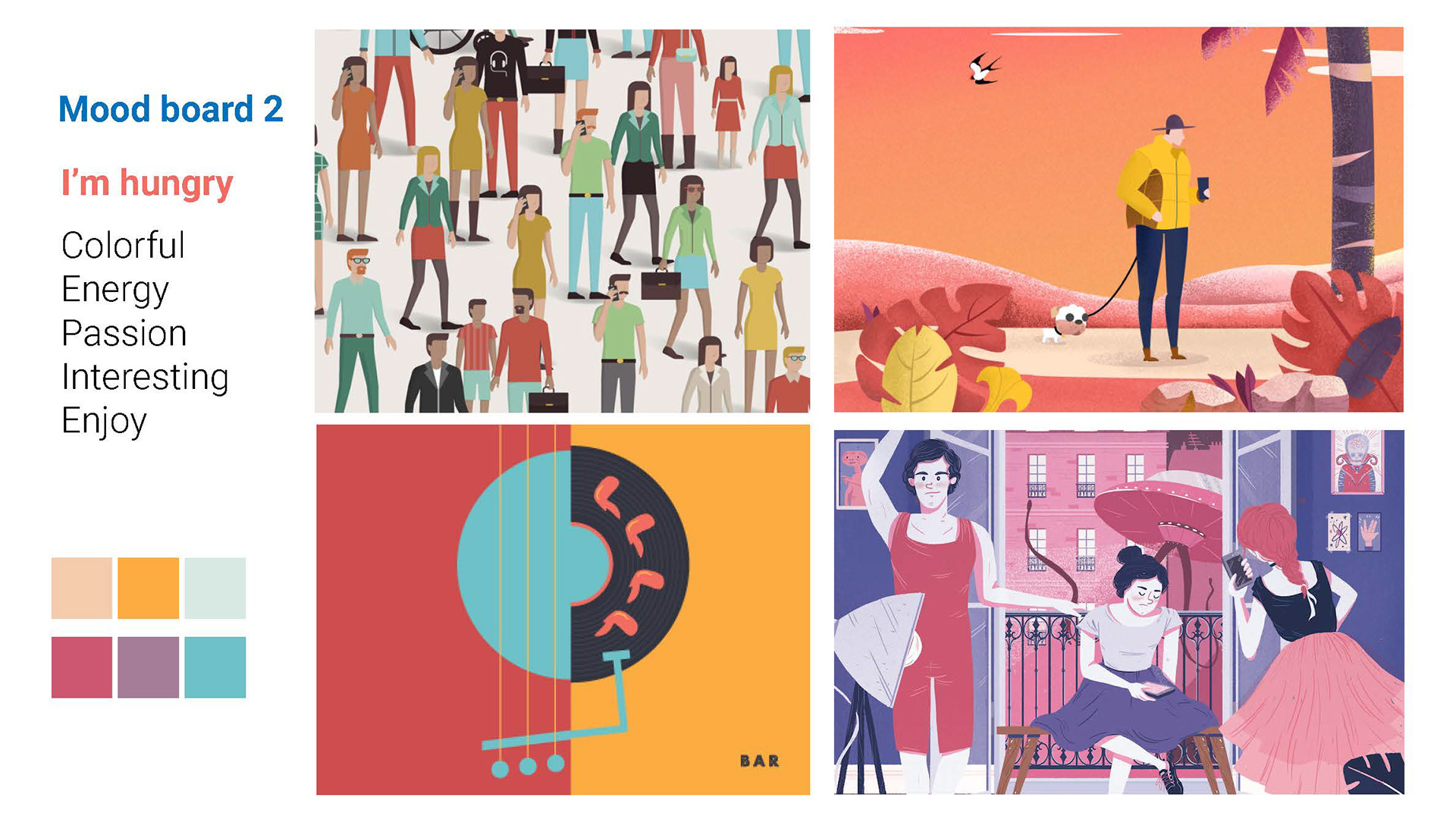
For Visual: Inspiration & Mood Boards
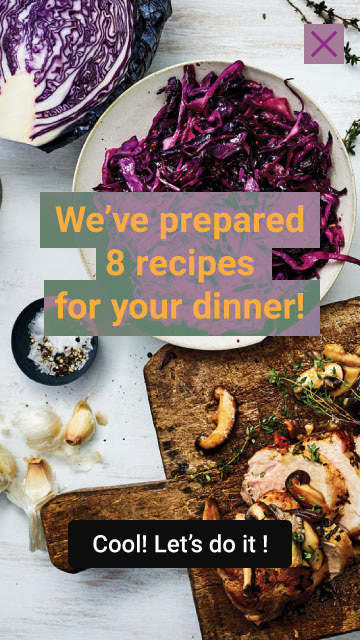
High-fidelity Prototype
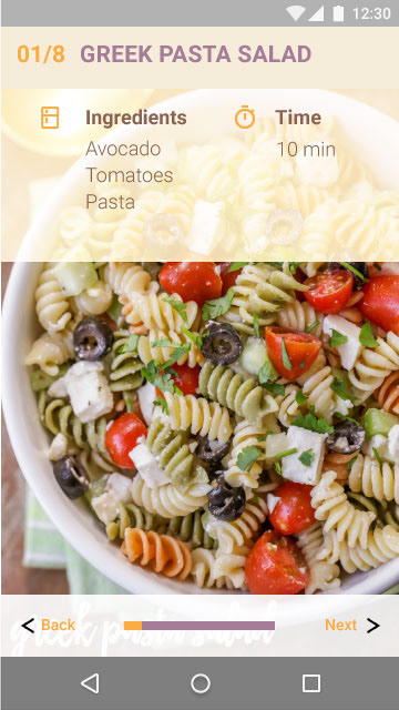
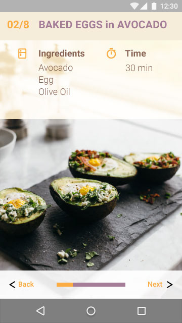
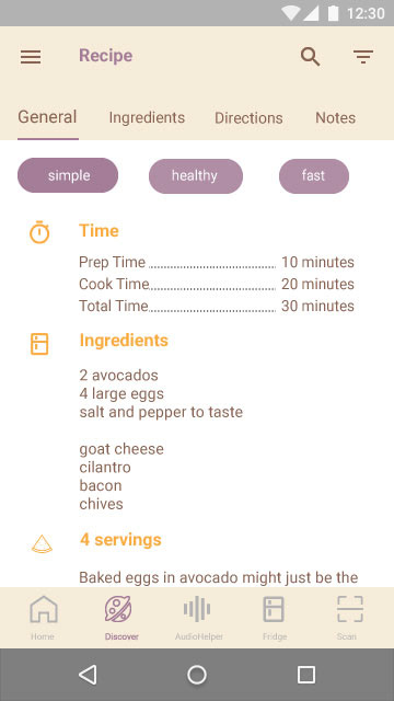
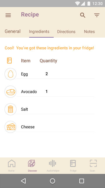
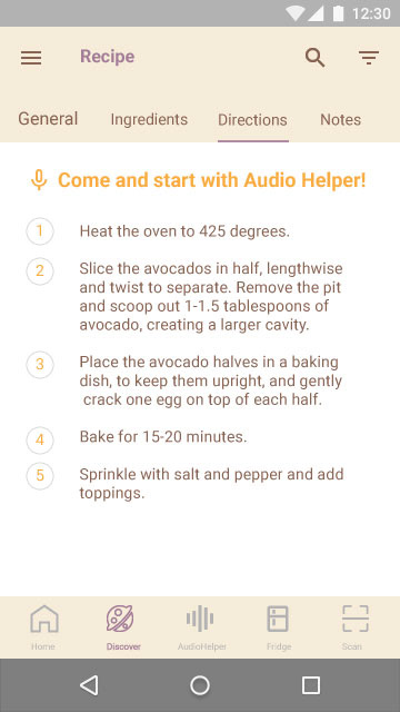
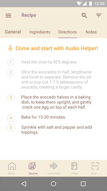
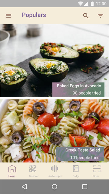
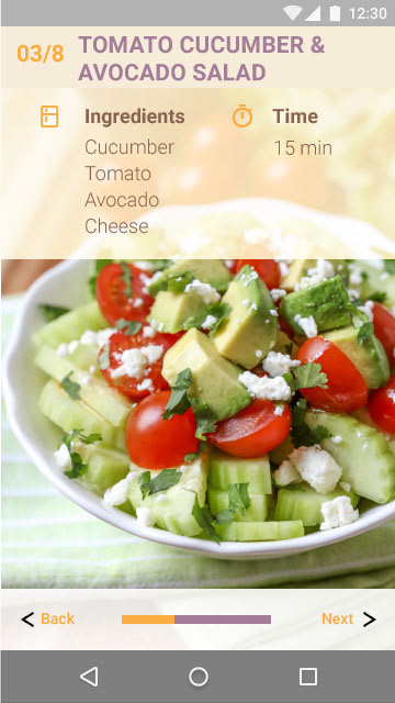
Testing the prototype
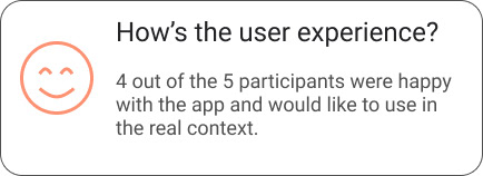
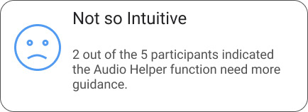
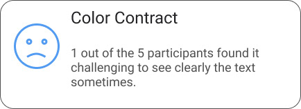
I conducted the usability testing sessions with 5 participants who were college students and could be the target users. The goal is to ask participants to complete 3 tasks under the given context in order to evaluate the prototypes' usability during the process and from participants' feedback.
Reflection
This was my first individual project that involving all the process, it was not easy but I'm proud of how it came out.
Two important things that I've learnt, one is how to balance the design goal with user's needs and using user study sessions to iterate and make adjustments; the second thing is to learn from others (peer designers) but don't let comparisons discourage you.
The next step is to make small adjustments on visualization based on usability testing to increase the user accessibility and iterate!