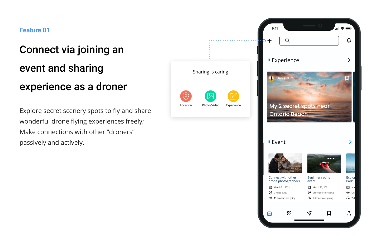
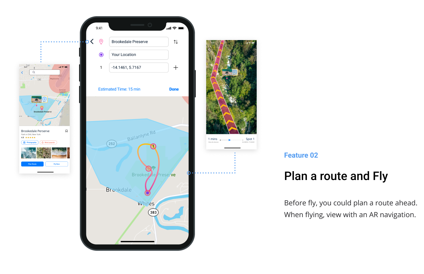
Project Overview
As drones become more popular and affordable as a tool to capture videos and pictures or just to have fun, drones started to get involved in people's life. However, Drone Community is concentrated and relatively exclusive, individuals have a hard time connecting to other drone users.
So I refined this solution based on a previous team project, in order to bridge the gap between the drone enthusiasts and the drone communities.
Challenge
"How might we strengthen the social fabric between drone enthusiasts and drone communities and solve the issues drone enthusiasts face as an individual or a group?"
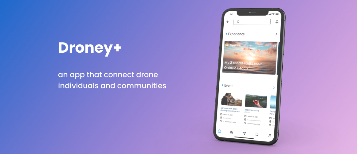
Solution
Droney+
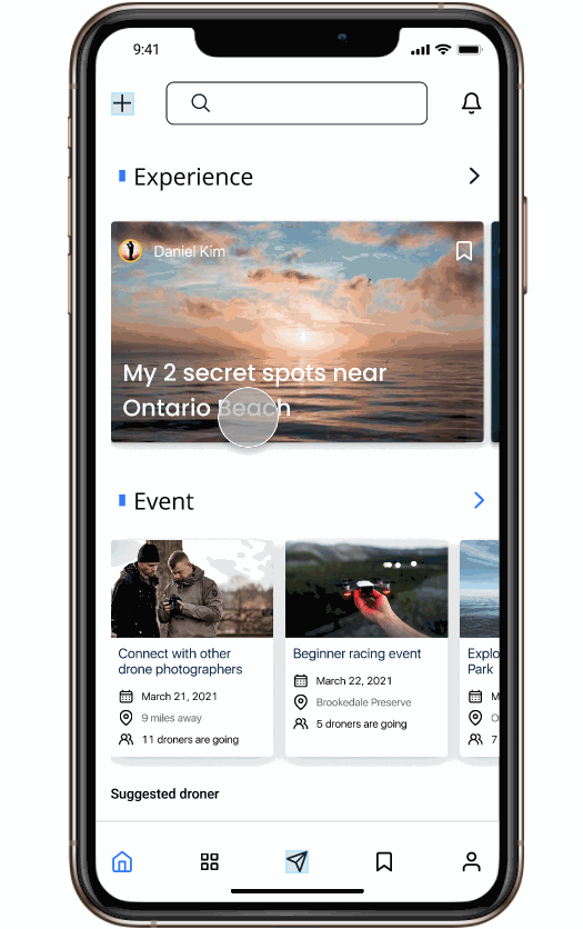
an app that provides a platform for drone users to connect with others, either actively- through joining events, sharing a location, or learning the experience from other drone users passively.
Role
•Stage 1-UX Researcher: Collaborated in background research, user research, and initial design process ;
•Stage 2-Sole UX designer
Redesigned the "Map" feature after the project ended
Tool
Figma, Balsamiq
Timeline
Stage 1-2018
Stage2 -2021
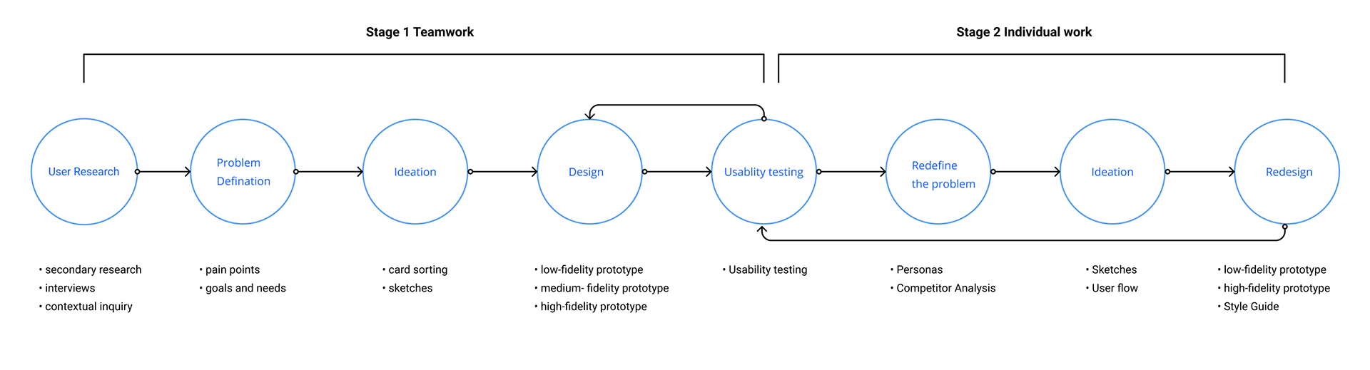
Process
Context
Since the drone community is formed demographically concentrated, groups are relatively specific and exclusive, individual drone enthusiasts find communication with these groups or connecting with drone individuals difficult due to various reasons.
Different groups have different ways to communicate, like using Facebook group or email. People who are new to drones may have a difficult time seeking information, and the professionals may not be able to connect with other hobbyists.
Stage 1
User Research
We had a big picture- building "something" to benefit the drone community. But we wanted to dig deeper into users' pain points and how we could help solve those problems.
We first completed secondary research, where I contributed my part by utilizing and analyzing the online resources and dataset. But there were too many aspects worth study, so we decided to conduct interviews with drone players to get some insights and deepen our understanding of the pain points.
our secondary research showing variety of the potential problems.
Interview
We conducted 10 semi-structured interviews with participants with different experiences related to drones, to understand the different categories of drones and the motivation of drone enthusiasts behind using drones.
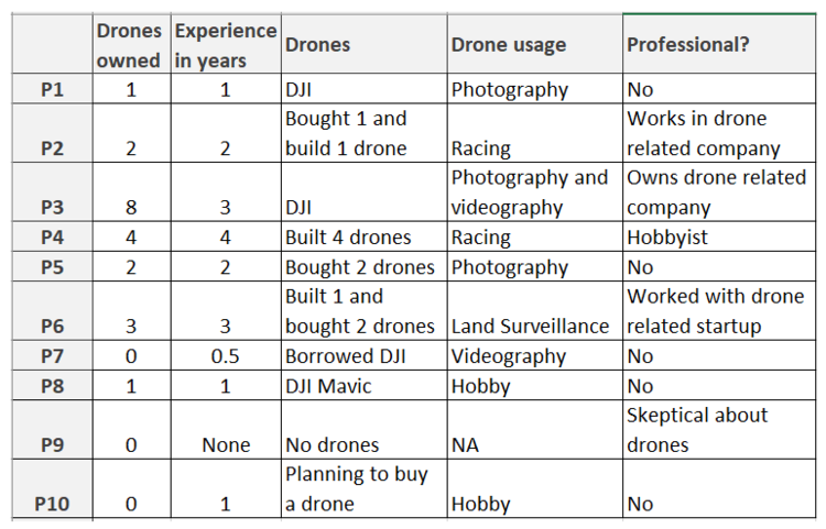
A quick overview
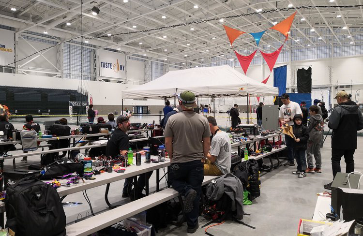
Drone Racing Event
The interviews lasted for about 1 hour per session, and the questionnaire covered the participant's purchase and flying experience, special skills regarding different usage of drones, rules and regulations knowledge, user experience, and impact on other people.
Most participants were recruited online, but I with another two teammates "intentionally" ran into a drone racing event and successfully invited 1 participant.
Journey Map
Here I summarized the research findings through present this journey map.
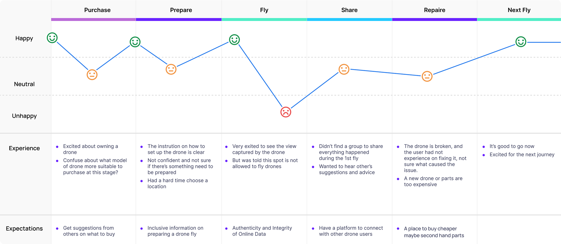
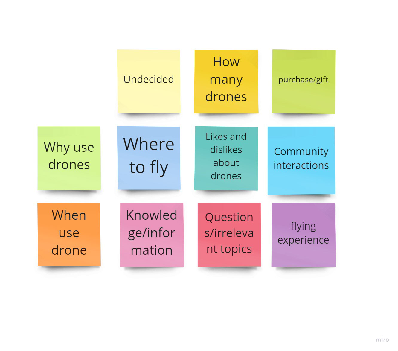
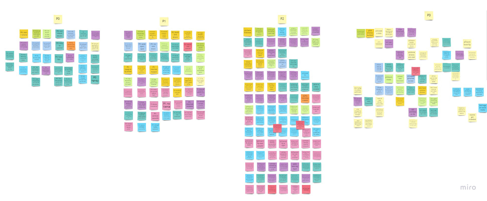
Qualitative Analysis
We applied contextual inquiry as a foundational method to complete qualitative analysis. All the interview notes were collaborated and organized on RealtimeBorad (miro).
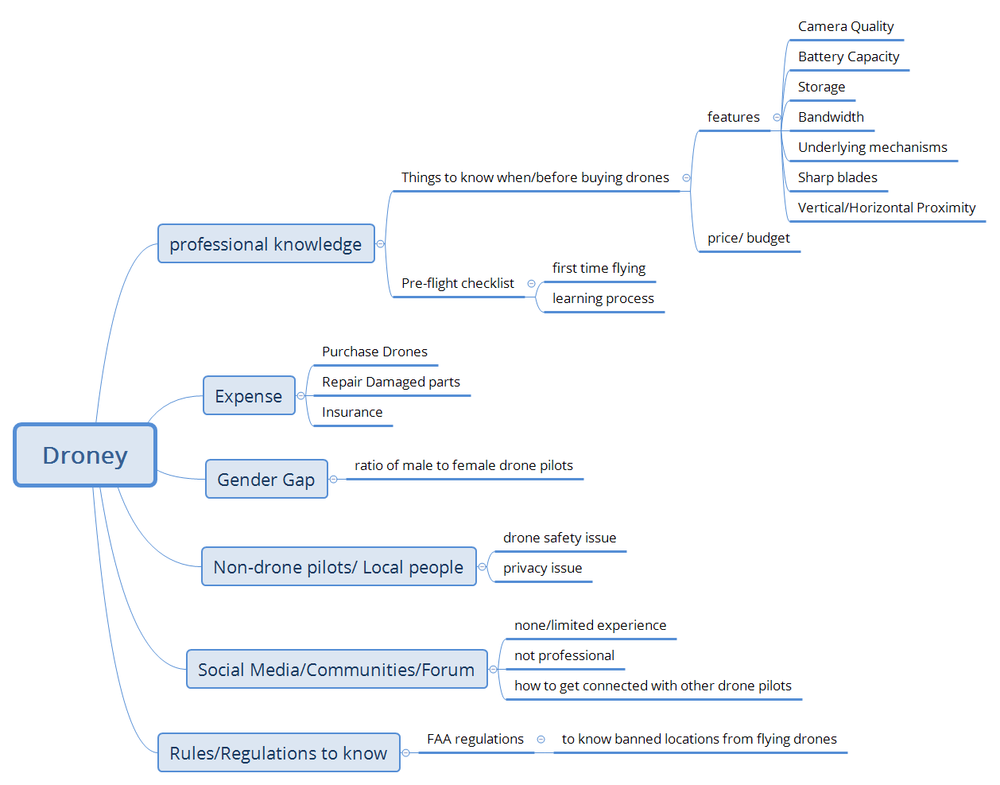
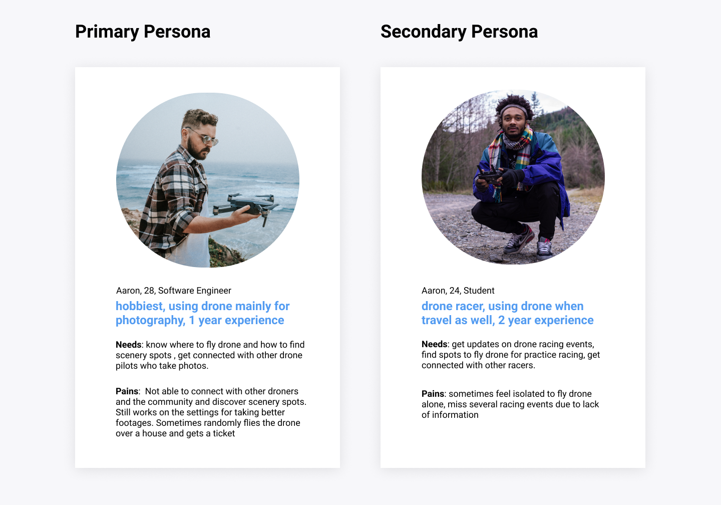
Based on the results, we concluded 4 pain points of users based on the affinity diagram and I created the user personas. The main features for Droney would work on solving those problems.
Insights
While in most cases, drones are used to capture photos and footage, some groups do focus on drone racing. Based on the research, we found 4 pain points that we wanted to focus on.
•Lack of Knowledge
•Authenticity and Integrity of Online Data
•Unavailability of Dedicated Forums
•Cost of Drones and Parts
For the app that we are building, 1) Map is a key function to search for a flying route 2) Marketplace is where users can buy and sell equipment 3) 1 to 1 Q&A board for knowledge inquiry 4) Resources provides up to date rules and regulations regarding drone flying.
Stage 1
Design Process
We sketched our solution and created the rapid prototype, we then conducted usability testing to get user feedback.
Check out the details of the 2 design iterations here.
User Feedback
We put the prototype further to the mid-fi prototype with color theme and actions applied. Then by conducting usability testing with 7 participants, we received very valuable feedback.
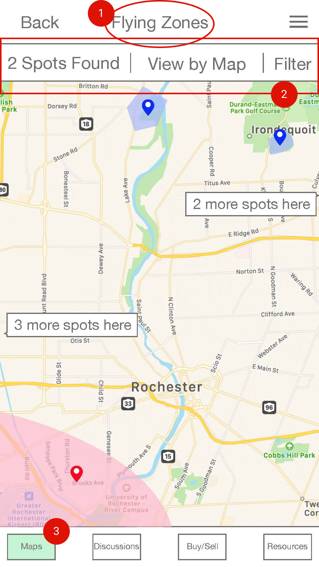
Problem 1 A gap in information portrayed
The header "flying zones" confused participants, it was vague to understand.
Solution: rename the label or remove the label.
The header "flying zones" confused participants, it was vague to understand.
Solution: rename the label or remove the label.
Problem 2 The not intuitive Hamburger menu
Only 1 out of 7 participants in the usability testing, noticed the Hamburger menu.
Solution: replace the Hamburger menu with a "Floating Action Button".
Only 1 out of 7 participants in the usability testing, noticed the Hamburger menu.
Solution: replace the Hamburger menu with a "Floating Action Button".
Problem 3: No home page
There was no home screen. Participants saw “Maps” when first started the tasks and were confused as there was no context available.
Solution: make minor adjustments so the "Maps" page would more look like a home page, or simply add a home screen
There was no home screen. Participants saw “Maps” when first started the tasks and were confused as there was no context available.
Solution: make minor adjustments so the "Maps" page would more look like a home page, or simply add a home screen
What I've learned from the teamwork
As a team, we completed our project by creating a hi-fi prototype and other deliverables, such as a video showcasing the context and the features of the app. As an outcome, we submitted the paper to the 2019 CHI Design Competition. It was a great experience to learn about the drone community and work on designing an app to help people connect with each other. The difficulty of this project is that we didn't have much knowledge and experience on drones and we were outsiders to the drone community. So I had a hard time understanding the problem and reach out to the people who fly drones.
Stage 2
Refining the solution
However, since all the issues we found based on user feedback were all on the Map feature, I decided to work on my spare time individually to redesign Droney and focused on the Map feature after the project ended.
Redefining the Problem& Understanding the Users
In the previous research, we figured the main motivations of using drones are 1) for photography and 2) for racing competitions, with various levels of experience. Here I want to make it more clear what the users look like and how users would use the "map" feature under certain contexts. Since drone racers are a small ratio compared to the community and they also do photography sometimes, so I concluded it as the secondary persona.
Pain Points
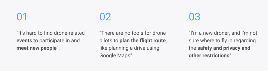
The summary was concluded based on previous user study data.
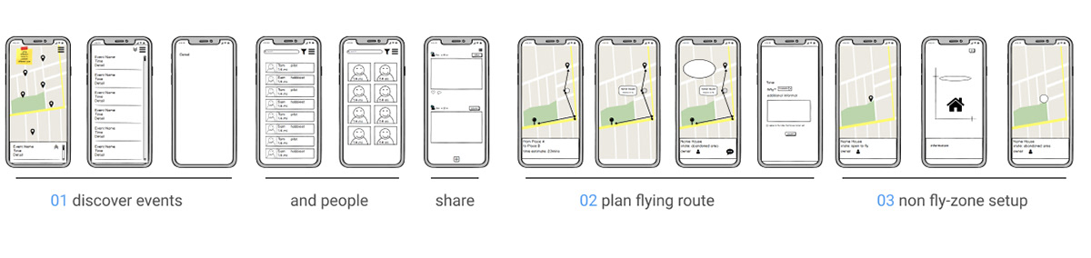
Ideation
I first came up with 3 very draft features to solve those problems accordingly.
However, I still felt these features are not specific enough so I decided to conduct a competitor feature analysis to get some inspiration.
Competitor Feature Analysis
It could be a miss, that in the previous work we never documented a competitor analysis although I did look up several apps in the market. Here, to study the "map" feature in existing drone apps, I decided to start a competitor analysis. In Google Play Store, there are not plenty of apps serving drone users. I chose these 4 apps which all contain a "map" feature.
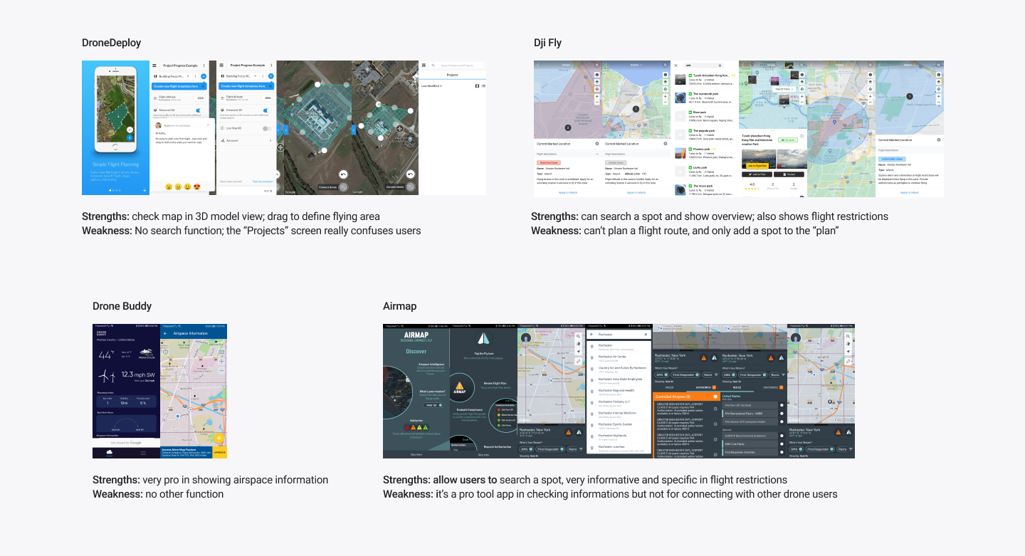
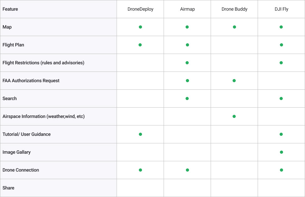
Green dot means the function is supported by the app.
Overall, the competitors lack sharing features; although 3 out of 4 apps have flight planning features, flight route planning is not usable. Airmap and Drone Buddy are informative and provide reliable and professional data resources, however, when first use the app, users may face a steep learning curve. Since the goal is to bridge the gap between drone individuals and the community, the design challenges are: How to make connections actively or passively while using the "map" feature? How to balance usability with displaying useful data?
Brainstorming the solution
Challenge 1:
How to make connections/networking actively or passively while using the "map" feature?
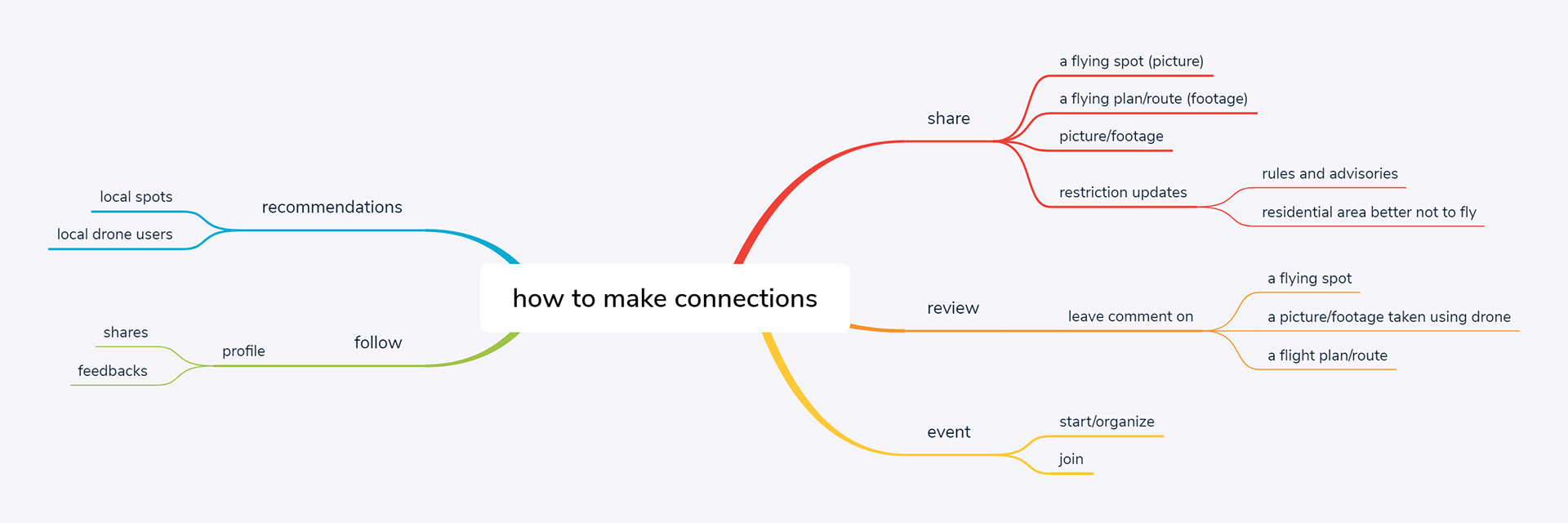
I did a quick brainstorm of how users can make connections based on the "Map" feature. After coming up with the brainstorming map, I studied Google Maps and Instagram as references for further conceptualization.
Challenge 2:
How to balance between usability and displaying useful data?
First thing first, to answer this question, it needs to make clear what type of the app will be. From the first beginning of the project till now, all the research findings indicate that it will be an app for social, for people to make connections; not a "tool", for users to look up professional resources, although it should contain some useful data.
Another strategy will be using more images to visualize and illustrate the content rather than using too much text.
Job To Be Done
Case 1:
After flying my drone, I took several good pictures from a spot, I'd love to share my experience and uncover a spot in the community, so others can explore and have fun as I did.
Case 2:
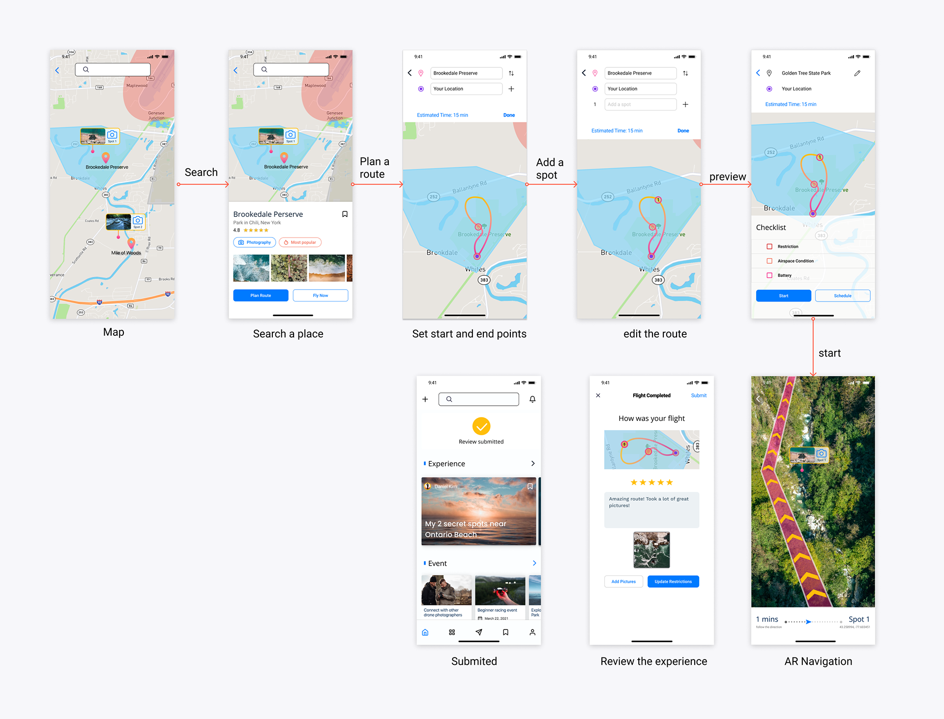
It's Saturday and great weather, I want to plan a drone flight, so I can get myself prepared and enjoy the moment flying drone.
User Feedback
I conducted 3 informal usability testing sessions with participants in order to validate the user flow and interaction design. I asked the participants to go through the 2 flows: share an experience and plan a route.
Here I got very valuable feedback:
•2/3 of the participants consider the app is intuitive- do not need instructions while performing the tasks.
•3/3 of the participants agree that the app could benefit them in connecting with the drone community
•2/3 of the participants mentioned they would like to see more details about the "Checklist" in the route planning section.
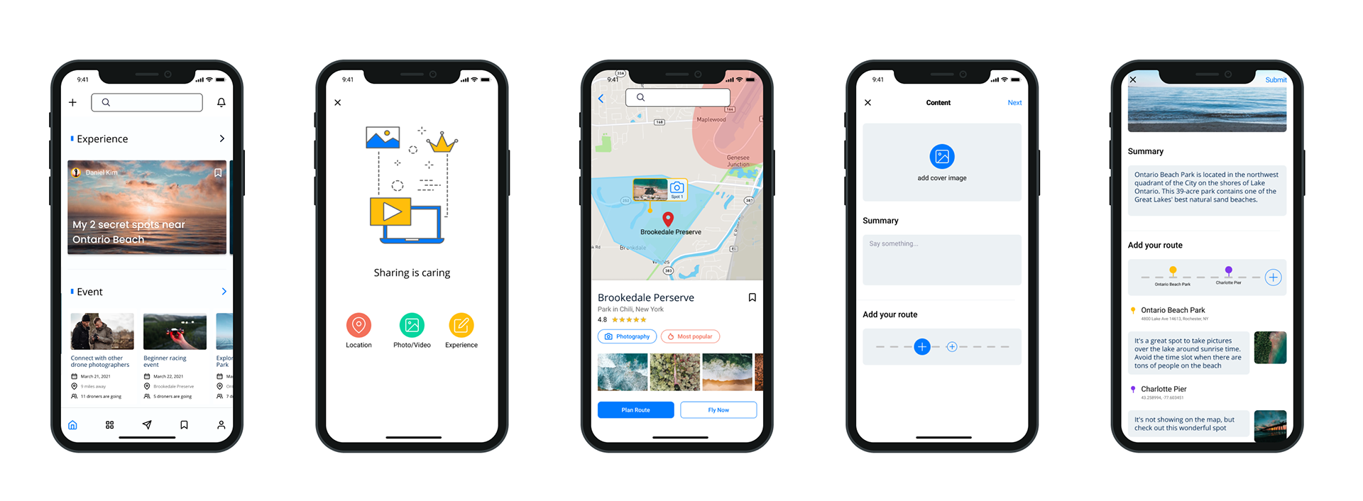
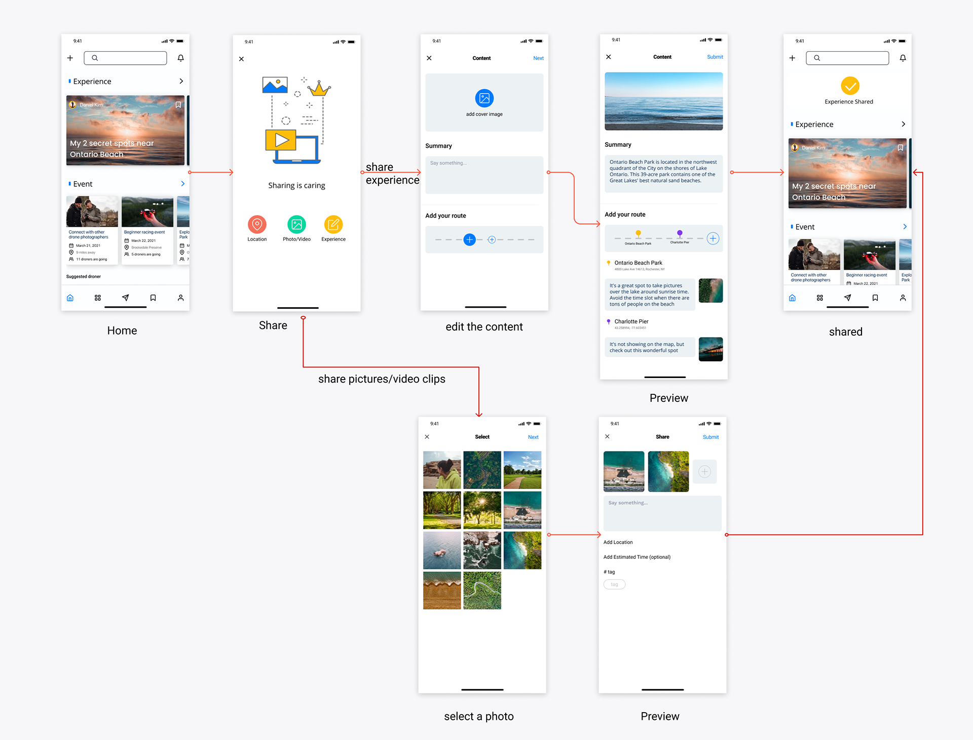
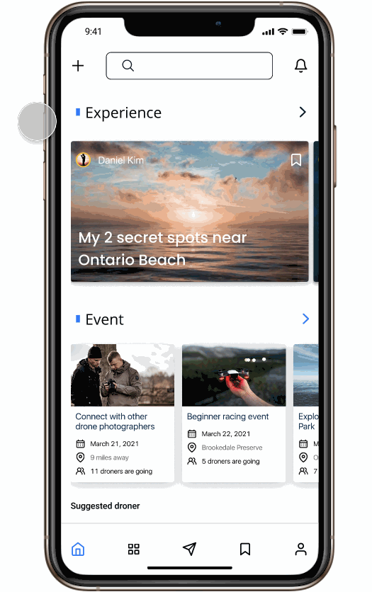
Overall flows
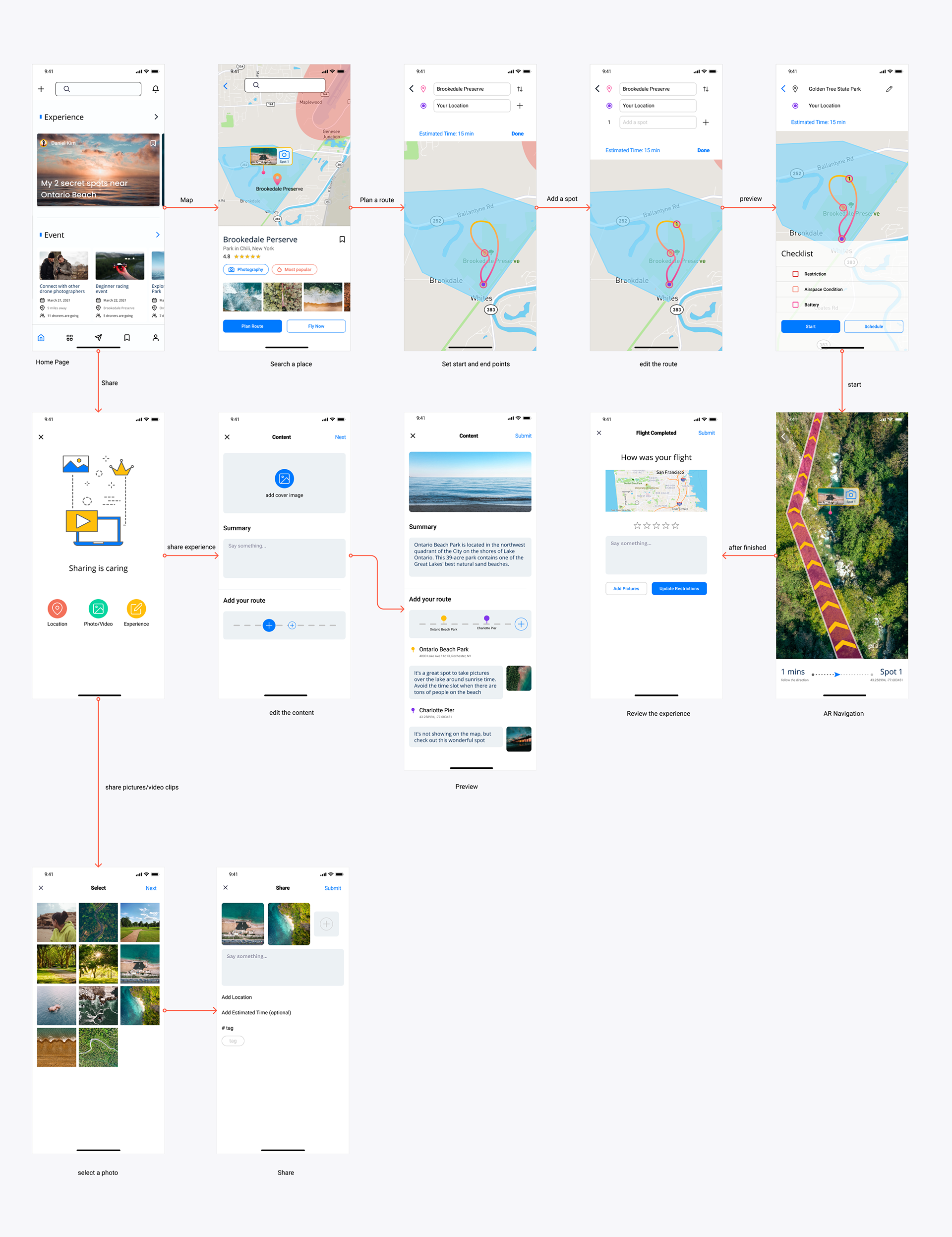
Hi-fi prototype with 2 flows. Click twice to view the details.
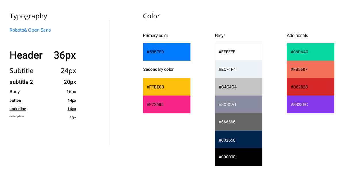
Style Guide
I used white them with the primary color to apply the minimalist design. I chose Blue as the primary color since it's neutral and it won't distract users from the content. I used Yellow and Coral as the secondary color if certain content needs to stand out since those colors won't mix up with a background that contains blue and green, such as photos of forests and sky.
What I've learned from working individually
When working on my own for Stage 2, I learned a lot of new techniques on design. It's also a good practice to think deeper on how to solve the problem in a better way. But I do miss the collaboration and critiques within the team.
The next step is to iterate the design based on feedback.