Client - www.skillslabel.com
www.skillslabel.com is a website with a patent-pending utility to track and manage skills that provide learners and educators a platform to create standard labels for learning resources and activities.
Product Overlook: Skillslabel.com
Role
Worked with the usability testing team during the whole process, including planning the study, communicating with the client, conducting usability tests, etc.
Method
Questionnaire, experimental study design, between-subjects study design, qualitative and quantitative analysis
Outcome
Link to the deliverables (including heuristic evaluation report, usability testing evaluation report) that we handed to our client.
Context
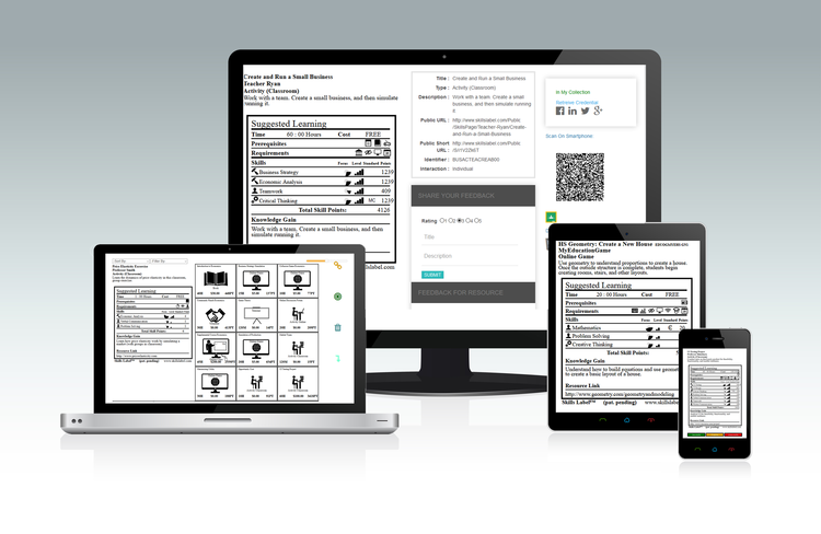
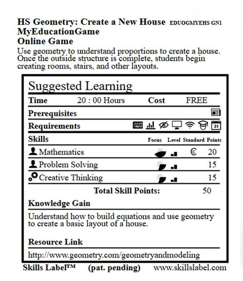
“Label Wizard” is the main function of the website to easily create “Skills Label”, which looks like an FDA nutrition label— but showing what specific learning resources are needed for mastering a skill or passing a course.
The first step was to schedule the kick-off meeting with our client, where the goal was to communicate our responsibilities and got deeper understandings of the needs and goals from the client.
To evaluate the usability and accessibility and to improve the user experience as the client's expectation, we conducted usability testing on “Label Wizard”, where users create the "Skills label".
Mission/ Goals
· Assess the usability of the Skills Label - Label Wizard.
For web interface design and iconography, are they intuitive?
For the workflow as creating Skills Label, is it ease of use?
· Provide an evaluation report, suggestions and other deliverables to the client after the testing.
Process
After the kick-off meeting, I as one of the evaluators did the heuristic evaluation to find the problems of current design and user flows from the entire website. Based on our findings, we scaled down to focus on testing the “Label Wizard”, since it's the main function and the user experience of creating labels directly affects users.
Last but most important, I went through several usability testing sessions with team as a moderator or an observer with 6 participants and handed the report to the client based on what we found after analyzing the data.

Overview of the Whole Process
The first step to design the usability testing is to figure out what are the research questions that need to be answered during the whole process. The goal of the client is to test the “Skills Label” website’s usability and the user interface, we decided to scale down to evaluate one of the main function “Label Wizard” which is to create the “Skills Label” and the icons due to time limitation.
Research Questions
•How easy is the “Label Wizard” function for participants (teachers: grades 7-12, and post-secondary) to create a Skills Label?
•Will the use of Skills Labels provide valuable utility for teachers? Are they useful?
•Is there any user-experience or workflow issue that participants encounter while using the system?
• Are icons intuitive enough for participants to understand the meaning/function behind when using the Label Wizard to create a skills label?
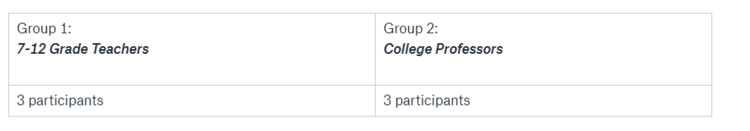
Participants
The user of the website are educators, including 7-12 grade teachers and college professors. We recruited 6 participants. Recruiting local educators is difficult, but if there more time for me to recruit or more bonus for the participants, I would like to recruit more participants.
Methods
Several research methods are used to collect both qualitative and quantitative data during the usability testing.
Before participants start, they were first asked to fill out a pre-evaluation survey, which is aimed to collect the demographics and basic information.
In the test, the participant would complete an icon-text match “game” that used the card-sorting method, to test whether the icons make sense or not, based on the participant’s matches.
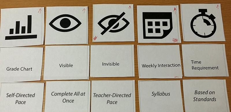
Icon-Text Match Layout
The second part of the testing asked the participant to go through tasks that use “Label Wizard” to create a “skill label”, to evaluate the usability of the certain function. Both parts were followed by a survey to collect quantitative data and qualitative data. There was also a post-evaluation survey to ask about the overall experience regarding the system. During the whole session, the participant was encouraged to use the “think aloud” method and was being observed to collect qualitative data if possible.
Tasks and Scenarios

Environment Setting
Although there is a usability testing room that could be reserved, we decided to set up the testing environment by ourselves which provided more flexibility to schedule sessions with participants since it would not be limited by slots availability of the usability testing room.
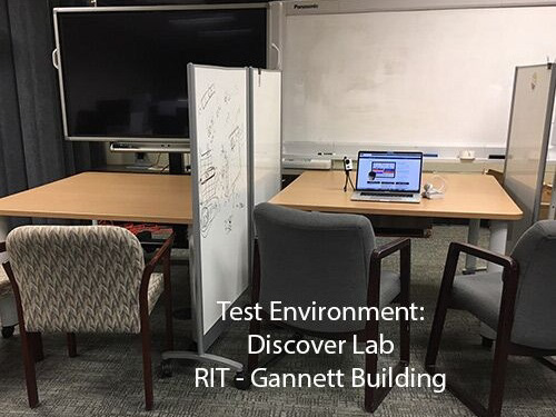
1. Test environment: Discover Lab

2. Observers: Left side
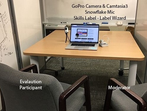
3. Participant & Moderator: Right side
Data
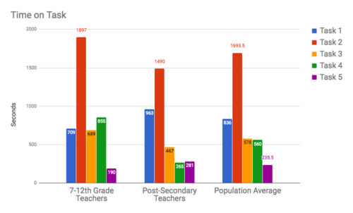
For Part1: Icon-Text Match and Part2: Create A Label Task, time on tasks and error count were note taken by the observer. Less time and error suggested a higher level of usability. For the quantitative data that we collected from the surveys, we used several methods to analyze and present the results, such as net promoter and System Usability Scale Analysis. We did across group analysis on the overall experience. Qualitative data such as verbal feedback and observation also contributed to the findings.

Net Promotor Scores
Examples of Data analysis and visualization
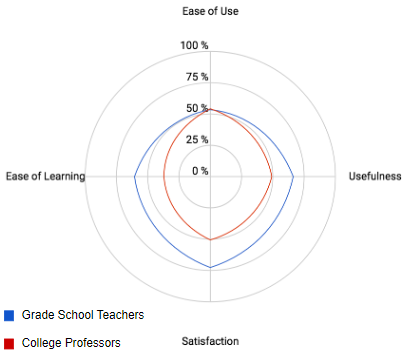
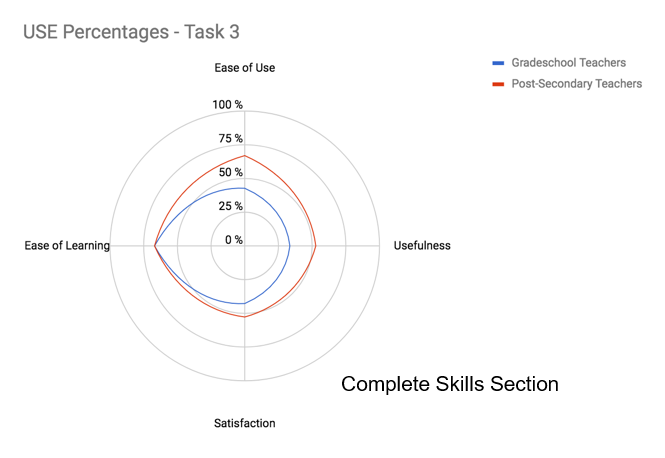
USE Quantitative Evaluation shows the levels of ease of use, ease of learning, usefulness, satisfaction on each task, and the average result on all tasks. Results did vary in two groups.
Histogram was used to visualize the data on facial expression, error count, and time on each task since the data are numerical and the histogram is clear to show the comparison among tasks and between groups.
Findings
Link to the deliverables (heuristic evaluation report, usability testing evaluation report) that we handed to our client.

Part 1: Icon-Text Match
We found the icons used in the system were not intuitive, which means the icons were not able to communicate what they stand for.
4 out of 6 participants failed all the 5 matches, the other 2 participants successfully paired 1 match.
Part 2: Create Label
Participants complained that the system was "lacking of useful instructions and tutorials".
Among 5 steps to create a label, the third step is the least user-friendly.
Recommendations
· Simplify the workflow, give options to skip; Improve the efficiency and user’s motivation
· Use icons from a standard library (such as Google Material Design icons, etc)
· Use a clearer/users' language and defining system terminology(such as error messages, label name), avoid jargon.
· Add help and tutorials of the system, to give a guidance for users who are learning how to use
Reflection
It was my first time to conduct the usability testing. I was nervous at the beginning as a moderator, although I practiced several times with my friend, thanks to my teammates' supports during the process, I completed without much stuck. Sometimes, the participant encountered some problem and couldn't move forward, it was difficult to find the balance when you should wait and when you should give the guidance. I enjoy the experience that I could talk to the client and provide feedback that the client valued.